How-to Tuesday: Testing a Paint Scheme
I’ve had an idea about what I want to do for my “Exemplar” Menoth Models. I really like the studio Menoth scheme. However, I don’t like being 100% true to the studio scheme. Even my Skorne have the little green sashes.
So, I wanted to use the studio scheme, but I wanted it darker, and yet I wanted to emphasize fire. I love the darker Menoth schemes that folks have done. Here are some examples.
So, I sat myself down with the color palettes I wanted to use, and a sheet of white paper. Here’s how I tested out the scheme without any fancy photoshop or without wasting a model (well, not exactly).

The colors I have here are:
- Sanguine Base -> Sanguine Highlight -> Carnal Pink
- Gun Corps Brown -> Menoth White Base -> Menoth White Highlight
- Ember Orange -> Heartfire -> Cygnus Yellow
The first two color sets are taken almost directly out of the Forces of Warmachine: Protectorate of Menoth book. The last set is my interpretation of some fire. I wanted it to be super bright.
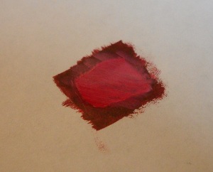 I want a dark scheme, so the dark Sanguine has to be the main color. So, I started painting.
I used a sheet of plain old computer paper, and painted a square. I put down two coats of Sanguine Base, and then a few coats of Sanguine Highlight.
Then, I mixed some Carnal Pink into some Sanguine Highlight and put that down.
I immediately didn’t like it. It was too bright.
So, I put some more Sanguine Highlight down after this picture was taken.
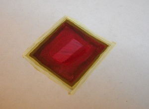 I then had to figure out what set of colors would go on the borders, and what color would go on the Menofix that’s traditionally in the middle. I decided to actually invert the traditional color scheme, so I painted the border white. Well, I used the three color progression listed above.
I realize it’s hard to see the white against the white paper, but it’s there. It’s also hard to see the brown, because it’s so close to the dark Sanguine Base.
So, that leaves the orange/yellow for the Menofix in the middle.
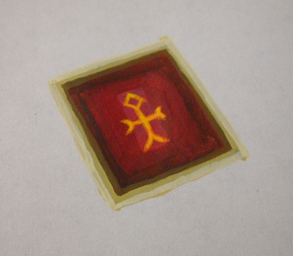
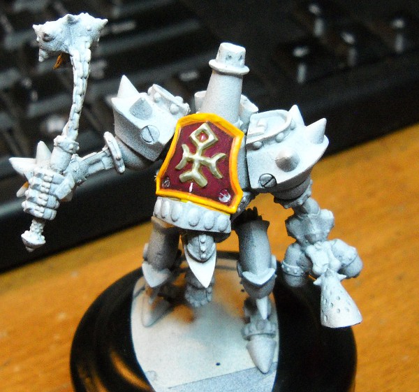
Overall, not too bad. I had a spare Repenter laying about, and so I decided to try out the scheme on it. Here’s how it turned out:
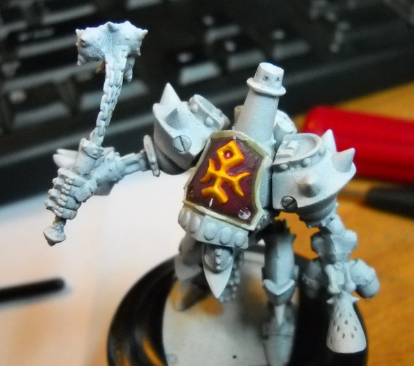
I think it turned out pretty well.
As I wrote this though, I’m beginning to wonder if I shouldn’t exchange the orange and white. White is a symbol of purity, honesty and faith, and that would be a more appropriate color for the holy symbol, not orange.
What do you think?
Nice how-to. I’ve done something similar, but no nearly often enough. Its a great habit to get into.
It’s a great cheap way to see how colors will look next to each other, in the same spacial ratios they’ll be in on the model. Cheap & Easy is always good.
I think the second one with the white menofix would look better overall across the warjack.
I do too. I think I’ll try it out on this warjack, and we’ll see how it goes.